How to Choose the Perfect Color and Size for Your Gallery Wall Frames
This post may contain affiliate links, which means I might make a small commission (at no extra cost to you) if you decide to make a purchase through one of these links. I only recommend products I actually use or genuinely believe will bring value to your home. Thank you so much for the support!
1/31/2026
Understanding the Basics of a Gallery Wall
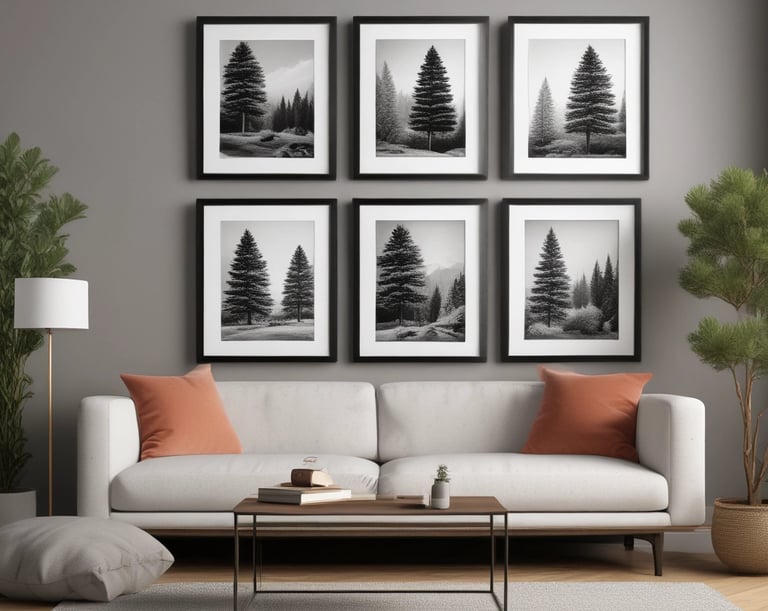
A gallery wall is an artful arrangement of frames, photographs, artwork, and decorations that collectively enhance a particular space within a home. This trend has gained substantial traction in modern home decor, allowing individuals to express their personality and artistry through curated visual displays. Unlike a traditional single-piece artwork, a gallery wall offers an eclectic aesthetic that showcases various styles, sizes, and colors, creating a unique focal point in any room.
One of the fundamental aspects of creating a gallery wall is the thoughtful consideration of color. The color palette of your frames and images can significantly contribute to the overall ambiance and emotional tone of the space. Lighter colors tend to evoke feelings of openness and can help small spaces appear larger, while darker tones often create a bold, sophisticated look. Moreover, selecting frames that complement the color scheme of the room can help your gallery wall harmoniously blend with other elements of the decor, resulting in a coherent design.
Equally important is the size of the frames being used. A varied arrangement with different sized frames can add depth and interest to a gallery wall. However, achieving the right balance is crucial; oversized frames can dominate a small area, while tiny frames can get lost in larger spaces. Finding that optimal mix not only enhances the visual appeal but also reflects the owner's personal style. Whether your aesthetic leans towards minimalism with space-saving designs or a more maximalist approach with oversized pieces, the choices made in color and size are fundamental in crafting a gallery wall that is both inviting and visually striking.
Choosing the Right Colors for Your Frames
When it comes to creating a cohesive gallery wall, the choice of frame colors plays a crucial role in enhancing the overall aesthetic. Understanding the principles of color theory can guide you in selecting hues that either complement or contrast with your wall colors and artwork effectively. The right frame color can draw attention to the artwork while also harmonizing with the room's existing decor.
Start by considering the dominant colors in the artwork you intend to display. If your pieces feature bold, vibrant colors, you may want to choose frames in neutral shades such as black, white, or natural wood to prevent overwhelming the viewer. Conversely, if the artwork is more subdued, incorporating frames in bolder tones can add visual interest and vibrancy to the gallery wall.
It is also essential to assess the wall color where the frames will be hung. For walls painted in softer pastels or whites, frames in darker colors tend to stand out and create a striking contrast, making the artwork pop. On the other hand, if you have darker walls, using lighter frames can provide a pleasing equilibrium, ensuring that the showcase remains captivating without becoming too heavy.
When coordinating with existing decor, take seasonal and personal style preferences into account. A modern aesthetic may call for monochromatic frame colors, whereas a bohemian style could benefit from an eclectic mix of colors and textures. Incorporating metallic frames can add a touch of elegance and warmth to any display.
Furthermore, colors influence mood. Warm tones can evoke a sense of energy and excitement, while cool tones tend to promote tranquility. Consider what atmosphere you wish to create in the room when suggesting frame colors. By understanding these factors and carefully selecting your frames' colors, you can ensure your gallery wall is not only visually appealing but also aligned with your desired emotional impact.
Determining the Appropriate Sizes for Frames
Choosing the right sizes for your gallery wall frames is crucial for creating a visually appealing display. Achieving a harmonious arrangement depends on understanding the concepts of visual balance, scale, and proportion. When selecting frame sizes, it is essential to consider how each frame interacts with the others, as well as the overall space available on your wall.
A successful gallery wall typically features a variety of frame sizes. This diversity contributes to visual interest, yet it is important to maintain a cohesive look. To achieve this, opt for a mix of small, medium, and large frames, ensuring that they relate to one another in scale. For instance, large frames can serve as focal points while smaller ones can add complementary details. Always keep in mind the proportion of each frame relative to the wall space. Too many small frames can make a wall appear cluttered, while oversized frames can dominate the area.
Before mounting your frames, it is beneficial to measure your wall space effectively. Start by determining the width and height of the area where you plan to create your gallery wall. Visualize the arrangement by using painter’s tape to outline where each frame will be positioned. This technique helps you understand how different frame sizes and shapes will fit together, allowing you to adjust placements before making any permanent decisions.
By carefully considering the sizes of your frames and how they interact, you can enhance the overall visual impact of your gallery wall. Ultimately, the goal is to create a balanced aesthetic that captures the eye while reflecting your personal style. Experiment with various arrangements until you find the perfect combination that resonates with you.
Arranging Your Frames: Tips and Tricks
After selecting the ideal colors and sizes for your gallery wall frames, the next crucial step involves arranging them in a way that not only showcases each piece but also enhances the overall aesthetic of your space. To begin the arrangement process, consider laying your frames out on the floor. This will allow you to visualize different configurations without permanently committing to any specific layout on the wall.
One popular layout is the grid formation, where frames are arranged in a symmetrical pattern. This approach creates a classic and orderly appearance, ideal for spaces that seek a refined look. Alternatively, you could opt for a salon-style arrangement, which features an eclectic mix of frames in various sizes and orientations. This method tends to convey a more casual and artistic vibe. When utilizing this style, it’s essential to create a visual flow by varying the distance between the frames for an organic feel.
Spacing is another vital aspect to consider. As a rule of thumb, aim for 2 to 4 inches of space between each frame. This can help unify the collection and guide the viewer’s eye across the wall. However, depending on the size of your wall and the frames, you may want to adjust this spacing slightly. Don’t hesitate to experiment with different distances until you achieve the desired effect.
Lastly, achieving a cohesive look goes beyond merely matching colors; it includes the style and texture of the frames. Mixing metallic and wooden frames can add depth while a consistent color palette ties the visual elements together. Before settling on a final design, allow yourself the freedom to rearrange and experiment with various configurations. Following these tips will help you create a gallery wall that not only showcases your favorite pieces but also reflects your personal style effectively.